Coloring the padlet experience through custom wallpapers
When you use a custom wallpaper, the accent colors will complement your wallpaper.

At Padlet, we believe in the transformative power of customization. Our goal is to provide a platform that is simple, elegant, and tailored to each user's unique preferences. We offer a stunning array of wallpapers and curated colors that are carefully chosen to complement each other. But we also recognize that some might want to use their own wallpapers that reflect their personal style, evoke cherished memories, or showcase their favorite things. It’s not just a tool for preference, but also to create a sense of ownership and identity on Padlet.
As a software engineer new to front-end design, I was challenged to enhance the custom padlet experience for our users. One way this could be done is by generating a color palette that would seamlessly blend with any custom wallpaper, resulting in a visually appealing and harmonious design. This would mimic what we currently have with the existing wallpapers that we offer. Thankfully I had Alec, one of our talented designers, to work with.
The Journey

As you can see in the above, our sidebar color here is white which doesn’t really match our background wallpaper very well. My goal was to generate a color for that sidebar and other secondary colors as a function of the background wallpaper.
To do this, I thought of extracting a dominant color from the custom wallpaper and using it for our sidebar color. My first thought was to use the average color. I summed up the red, green, and blue RGB pixel values and divided them by the total number of pixels in the image. The problem with this is that sometimes the average color returned would not be within the color palette of the wallpaper. An example would be a background heavily weighted on red and blue would return purple. We wanted our dominant color to be closer to either red or blue.
So I turned to color quantization. The idea behind this is that we use a clustering algorithm such as k-means to narrow down the color palette of the wallpaper and then return the most dominant cluster. The good thing about this method is that Padlet already uses this for generating the section title bar color so it was nice and easy for me to reuse some of the code.
I soon hit a roadblock. Although the sidebar looked nice for the initial prototype, I struggled to find colors for other components that would create contrast, such as the "Add new post" button. I experimented with inverted colors and lighter/darker shades, but they did not seem right, at least in terms of color, so we had to come up with a different solution.
Color Matching
The idea of color matching came to us as a potential solution to all our customization problems. Padlet had already carefully curated a selection of colors that complemented our existing wallpapers and were mapped to various components. I realized that if we could use these pre-selected colors to match the dominant color of a custom wallpaper, it would result in a simple yet elegant custom padlet.
Finding the Algorithm
I was eager to dive straight into finding an efficient algorithm for color matching. My first thought was to use the Euclidean distance. Since colors are represented by 3-dimensional vectors in a finite space in their most common representations (RGB, HSV, HSL), calculating the L2 distance between two colors could be a possible measurement of how ‘close’ two colors were. The hypothesis was that the lower the distance, the more visually close the two colors were.

Upon testing, we quickly realized that this problem was much more daunting than anticipated. RGB, HSV, and HSL have non-linear dimensions meaning that the distances between two colors could be numerically small but perceptively huge when it comes to 'seeing' the colors. To account for this, I experimented with adding weights to each dimension in RGB and HSL and although the results looked better than using raw L2 distance, the root problem remained - the dimensions are non-linear.
We also experimented with our own ‘perceptively weighted’ algorithm which achieved better results.

Here are some samples of colors generated by these algorithms.
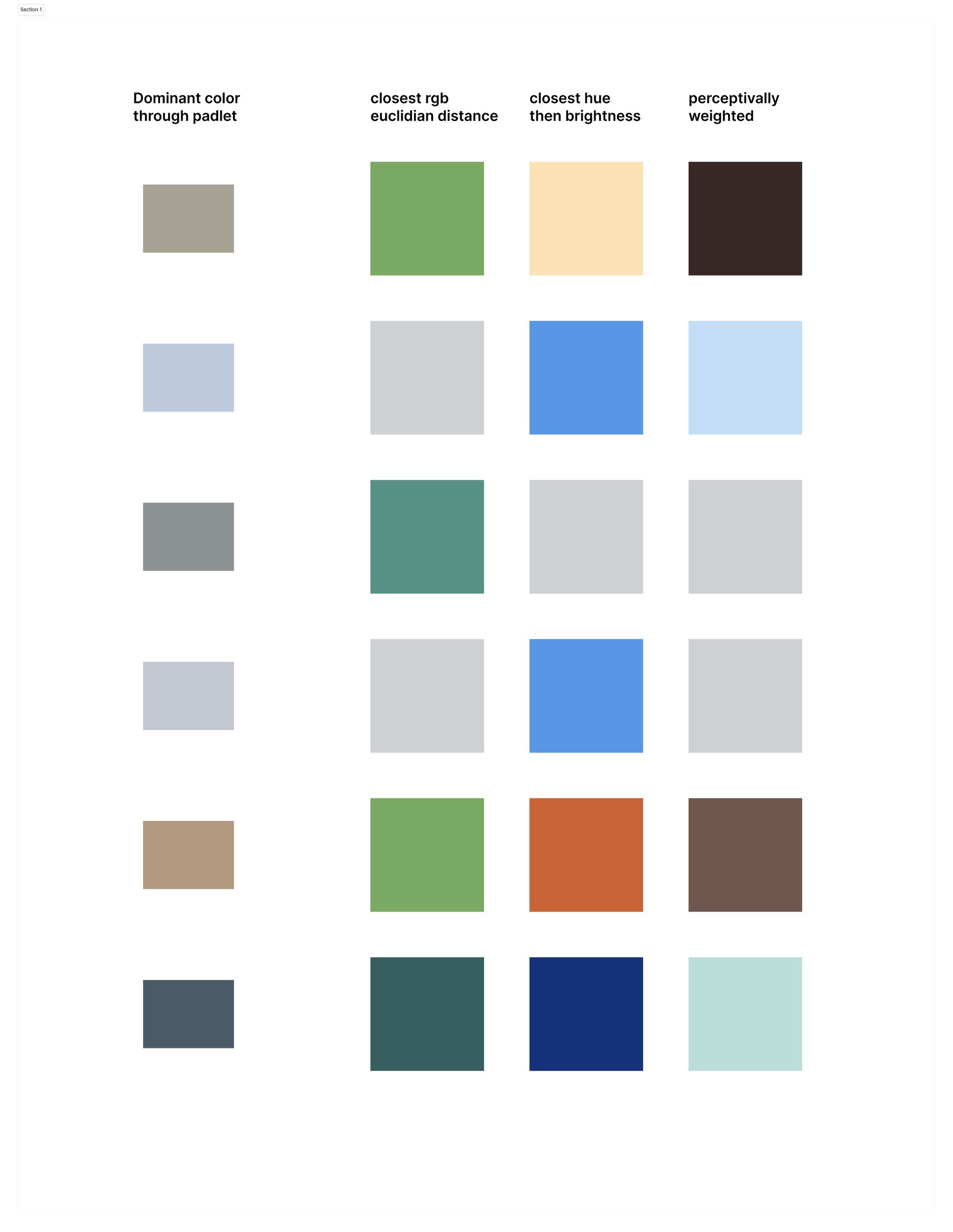
However, these results still didn’t meet our expectations.
Introducing the CIE
I wanted to find a perceptively uniform color space. In other words, the difference between two colors in the same color space should correspond to the perceived difference between those colors by the human eye. And this is how I ended up with the CIE Lab*.
The CIELAB color space, also known as CIE Lab* or simply Lab, is a globally recognized and widely used color model developed by the International Commission on Illumination (CIE) in 1976. It is also the result of many years of research to design a perceptually uniform color space.
For a brief intro, CIELAB consists of three dimensions: L* represents lightness, ranging from 0 (black) to 100 (white); a* represents the red-green axis, with positive values indicating red and negative values indicating green; and b* represents the blue-yellow axis, with positive values indicating yellow and negative values indicating blue. To calculate how close two colors were, we would simply apply the Euclidean distance using the Lab coordinates.

This color model however was superseded by the 1994 and 2000 formulas, as the CIELAB space was discovered to be less perceptually uniform than originally planned, particularly in areas with high saturation.
At Padlet, we seek perfection in our designs so there was no question nor doubt for us to use the best possible color matching model - the CIEDIE2000.
CIEDIE2000
The CIEDIE2000 algorithm is a complex algorithm that involves quite a bit of math. Its main purpose is to address the limitations of the earlier formulas (CIE76 and CIE94) that often resulted in inaccurate or inconsistent color difference measurements. It incorporates advanced features such as varying levels of chroma and hue, as well as a more refined consideration of lightness. The formula considers the non-linear relationship between color coordinates in the CIE Lab color space and human color perception, resulting in more accurate and reliable color difference measurements.
One of the key improvements in CIEDE2000 is the inclusion of hue rotation, which compensates for the tendency of the CIE94 formula to underestimate color differences in the blue region of the color space. Additionally, the CIEDE2000 formula introduces a weighting function to provide better agreement between calculated color differences and those perceived by the human eye. This enables it to deliver more reliable and consistent results which is exactly what we wanted.
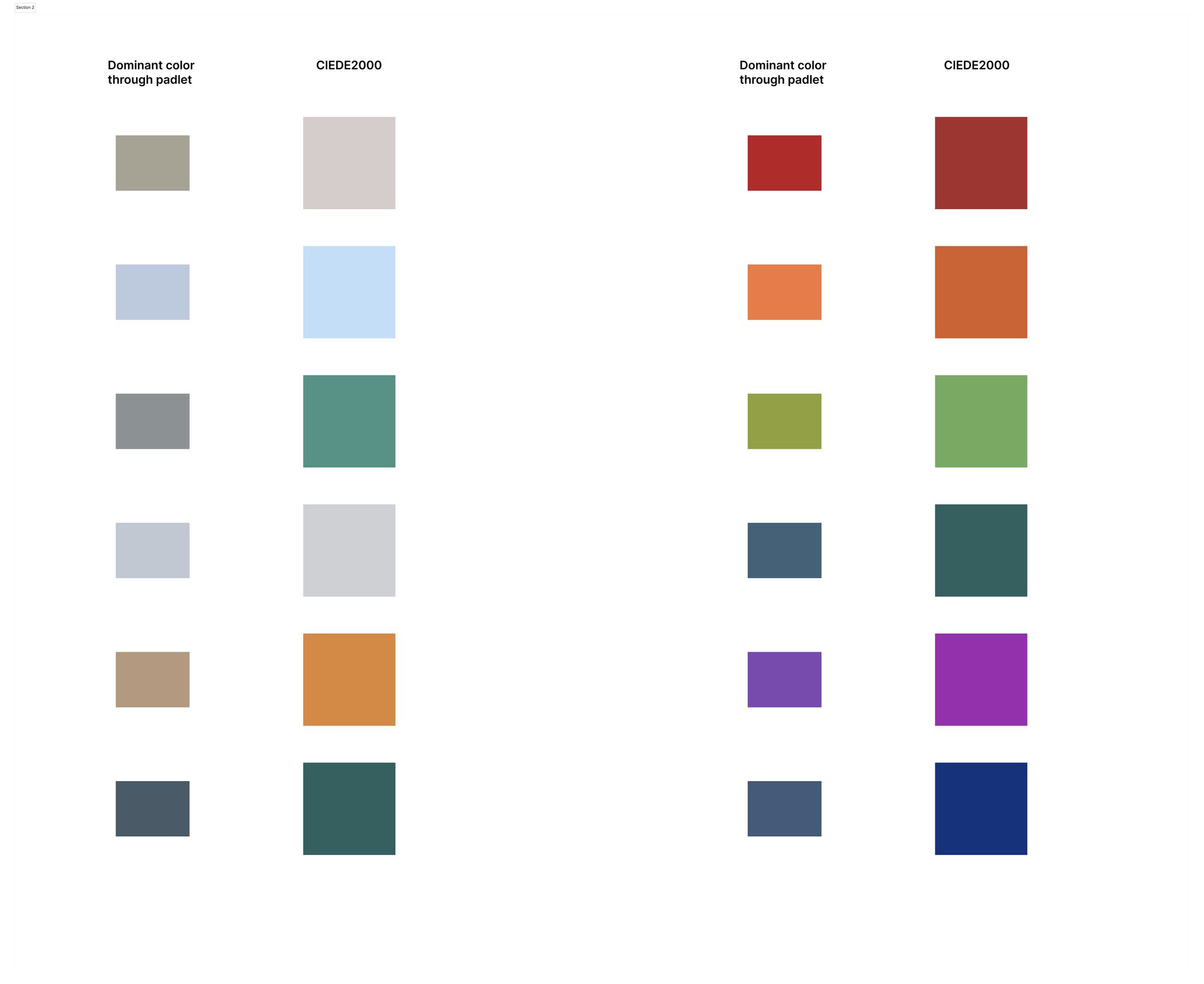
Here is a sample of what CIEDIE2000 algorithm returns us.
If you want to explore more about CIEDIE2000 you can read more about the formula and the observations here.
Results
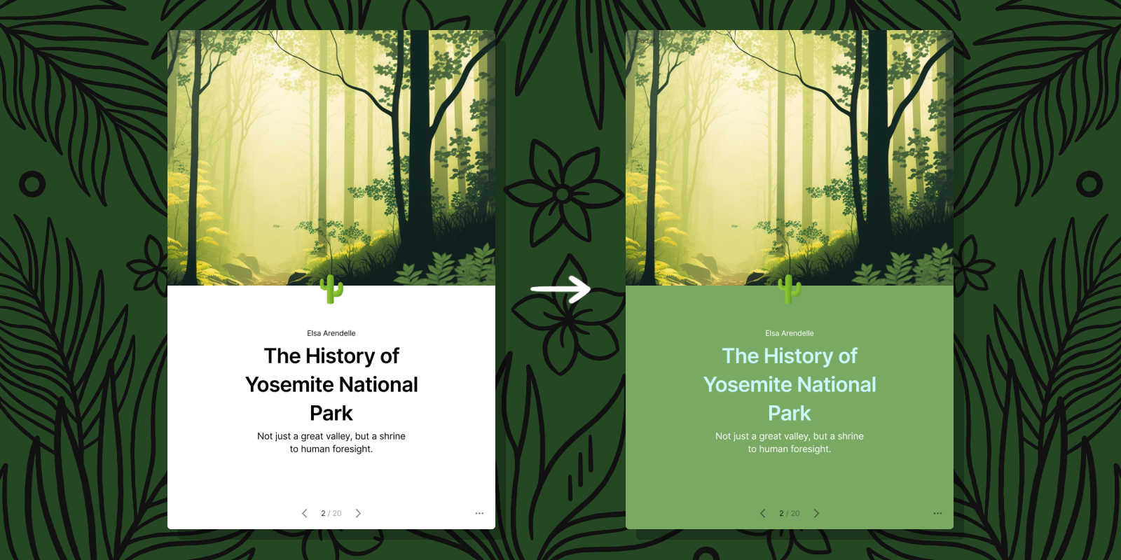
This is what we had before:

And now this is the newly updated padlet with our new colors.

Looks so much nicer right? And the equivalent slideshow

Launching
This was my first project at Padlet. I began only two weeks after starting and I feel extremely grateful and excited to start with such a cool project. The world of colors has definitely been giving my head quite a few scratches for the last couple of days, but seeing Padleteers all around the world use my work makes it all worth it. I want to give special thanks to my amazing team and Alec for the initial design inspiration.
All in all, to sum it up.

P.S. We're hiring! If you believe in Padlet, we'd love to hear from you. Apply now!