New attachment picker
A brand-new look and a more intuitive design.

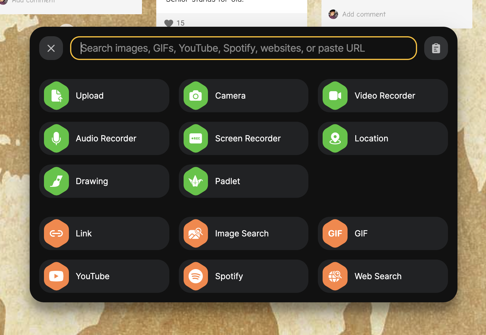
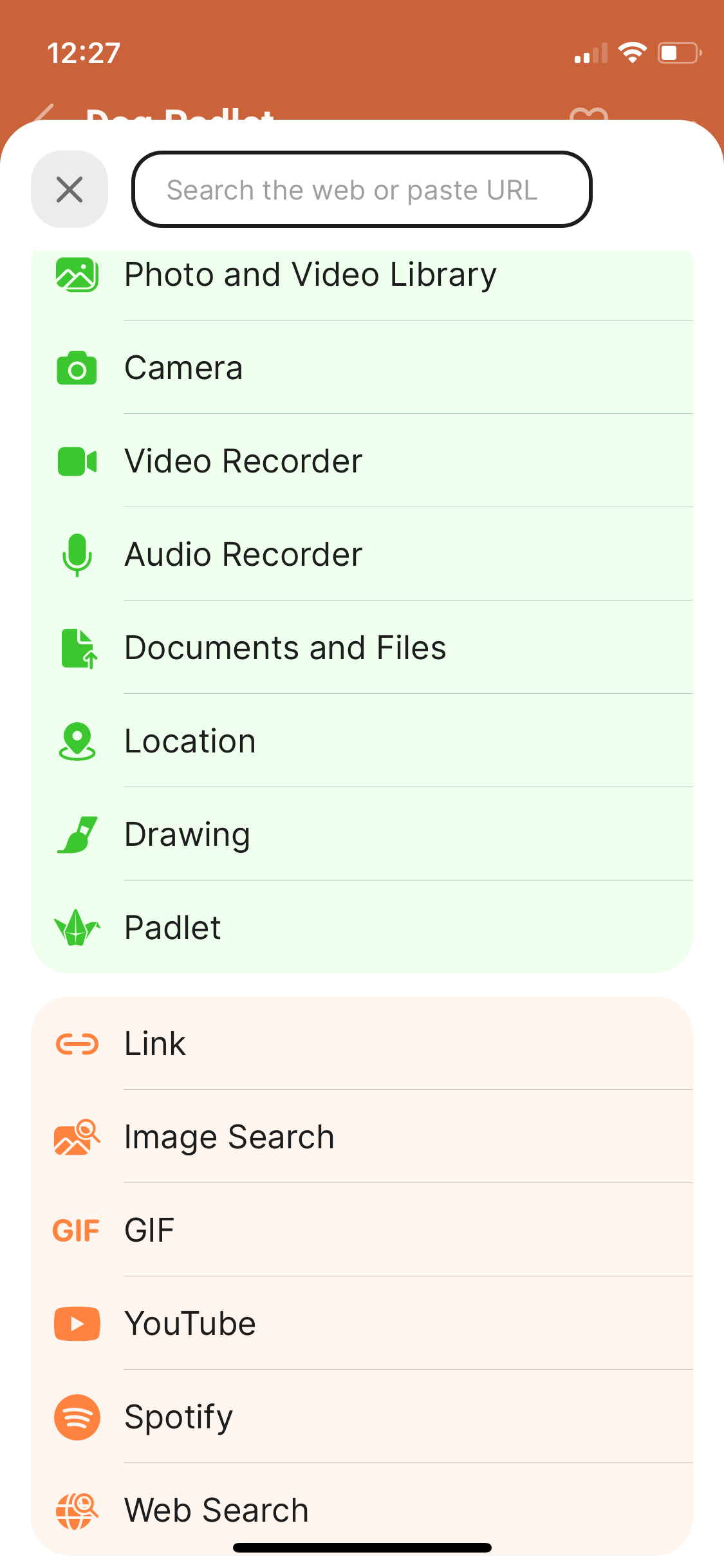
If you've used Padlet recently, you might have noticed a new look to our attachment picker. When you add a post and click on the three dots to expand all of the posting options, this is what you will see.


It is largely a cosmetic change, but it includes a major improvement to the search function.
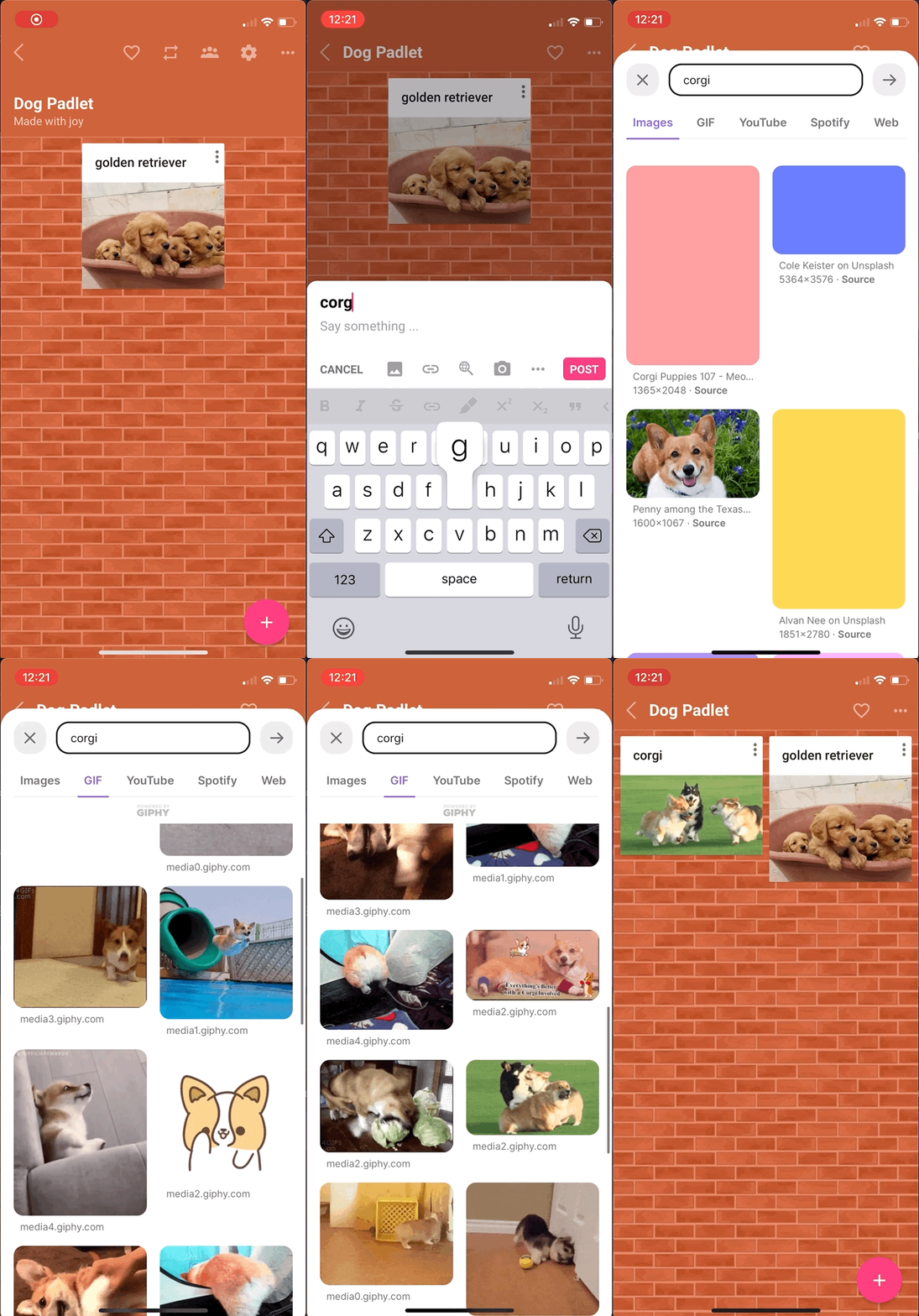
First of all, we realized how frequently Padleteers were using our web search to add photos, videos, and links to their posts. In response to that, we have placed web search front and center. When you open the attachment picker, you can start searching immediately.

In addition, we are now preserving your recent search history. Your most recent searches will only be a click away!
Because we moved the search from a sidebar to the middle of the screen, we can show you more options for your searches. We've also gotten rid of pagination and replaced it with an infinite scroll, so you can look at a lot of options before making your choice.

Finally, we have a clipboard option to the right of the search bar, so if you have copied something from another page, you can click the clipboard to paste it into the search bar.
Beyond these search improvements, we are beginning to support dark mode, starting here with the attachment picker. Be on the lookout for more dark mode in different parts of Padlet in the weeks and months to come.
If you have feedback to share about the attachment picker or about any Padlet features at all, drop us a line. Talk to you soon!
Love, laughter,
Julia

