Sections: a new system for organizing posts
Now you don’t have to choose between organization and visualization.
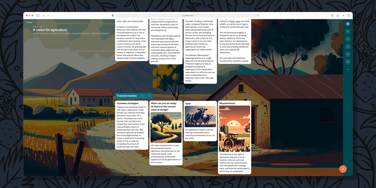
The urge to categorize and group is innately human. In our newspapers, we categorize stories by topic and we group them by page. In our kitchens, we categorize silverware and group them in tiny compartments within narrow drawers. We categorize one another by age, and interest, and skill-set, and we group into countries, and companies, and teams.
In the beginning, Padlet offered only one format: canvas. The canvas format offered total freedom, but lacked organizational infrastructure. Our users responded positively when we introduced additional formats with greater organizational capabilities, such as wall, grid, and timeline. Among the early formats, wall was the most popular. Then we added the shelf format, which became the second most-used.
What made shelf so popular?
Shelf differentiates itself from other formats because it provides the ability to categorize and group posts. This ability is highly valuable. In fact, we found ourselves defaulting to shelf because of its organizational power, even at the expense of properly visualizing and displaying our content.
Given this information, we decided that the ability to divide posts into sections should not be limited to one format. Categorization and grouping is natural and helpful and going forward it will be a core aspect of every padlet.
We are adding sections to all formats except for canvas. Now you don’t have to choose between organization and visualization.
How we did it
The first thing to do was figure out what grouping by sections would look like in all padlet formats. We needed a way to visualize different groups of posts, so we designed a header that marks the beginning of a section and contains the section name. The header has a slight angle at the edge to draw the viewer’s eye to the posts contained in that section. For the color of the header, we used the primary color of the padlet’s wallpaper. This color nicely complements the wallpaper while providing a bit of contrast so headers are easily identifiable. We wanted to make organization as simple as possible so we added a number of actions to each header including: add a post to a section, move sections, and add new sections.
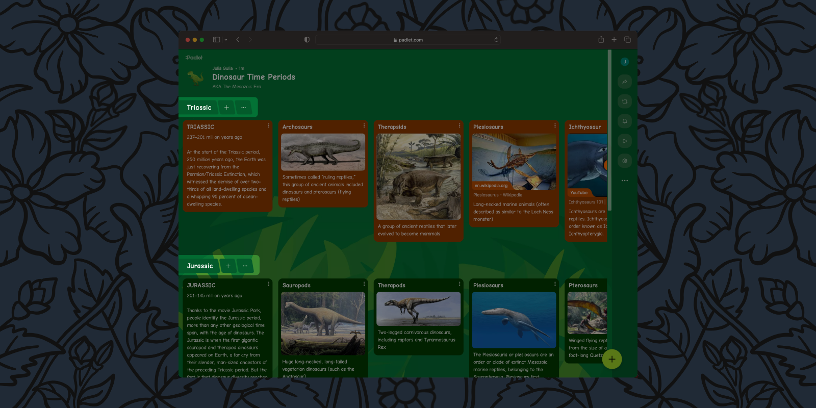
We then turned to figuring out what grouping posts by section would look like across all padlet formats.
Grid
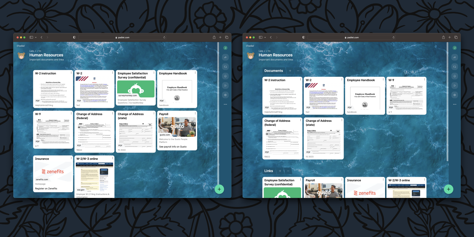
When using grid, posts are arranged in a neat matrix of rows and columns. When adding sections to grid, we wanted to keep this structure. When grouping by sections in grid, posts are arranged in their familiar grid format within a section, and those grids are stacked one on top of the other vertically.
Stream
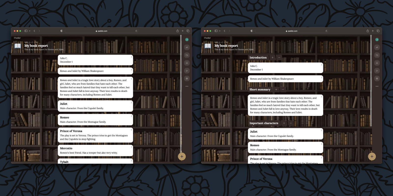
In stream, we wanted to keep posts big and beautiful while maintaining the simple vertical feed layout. It seemed natural to subdivide the stream of posts according to sections.
Map
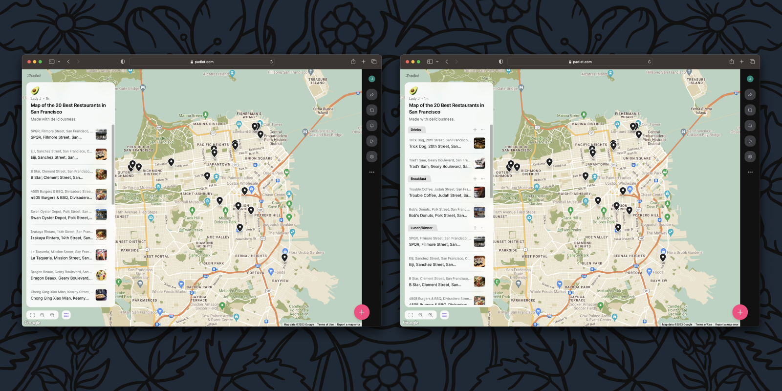
The map format posed a challenge because there is no inherent organization to posts placed based on their location. However, maps do have an organized list of posts in a panel, so we leveraged that to group posts based on sections.
Timeline
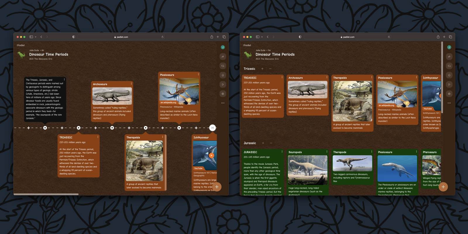
The timeline format is used to display content chronologically. With sections, you can now display multiple timelines at once. To support this change, we simplified the layout by eliminating alternating top and bottom posts and instead aligned the posts in a straight horizontal line. Users with existing timeline padlets can still take advantage of the current layout for now.
By removing the alternating posts, we are also removing the line and new post buttons that are visible in between existing posts. Instead, you can add posts in between existing ones by opening the action menu of a post and clicking add post before (or after).
Wall and shelf
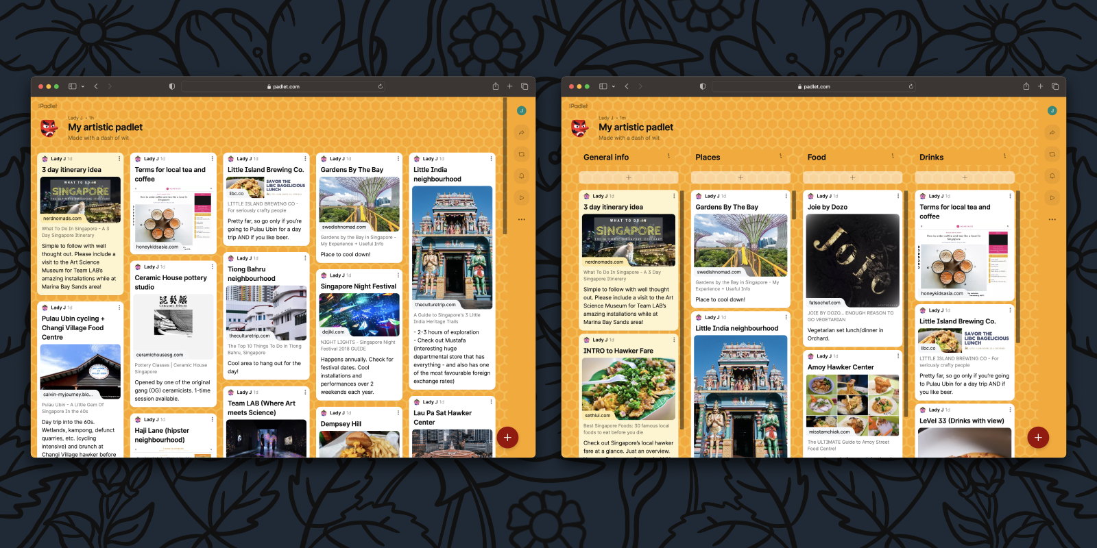
The wall format displays content in a brick-like layout. The shelf format displays content in columns with a brick-like layout. Given this overlap, we are eliminating shelf as an official format. Instead, to achieve the functionality of a shelf, you can create a wall and add sections. Existing shelf padlets will continue to work as normal.
Adding posts to sections
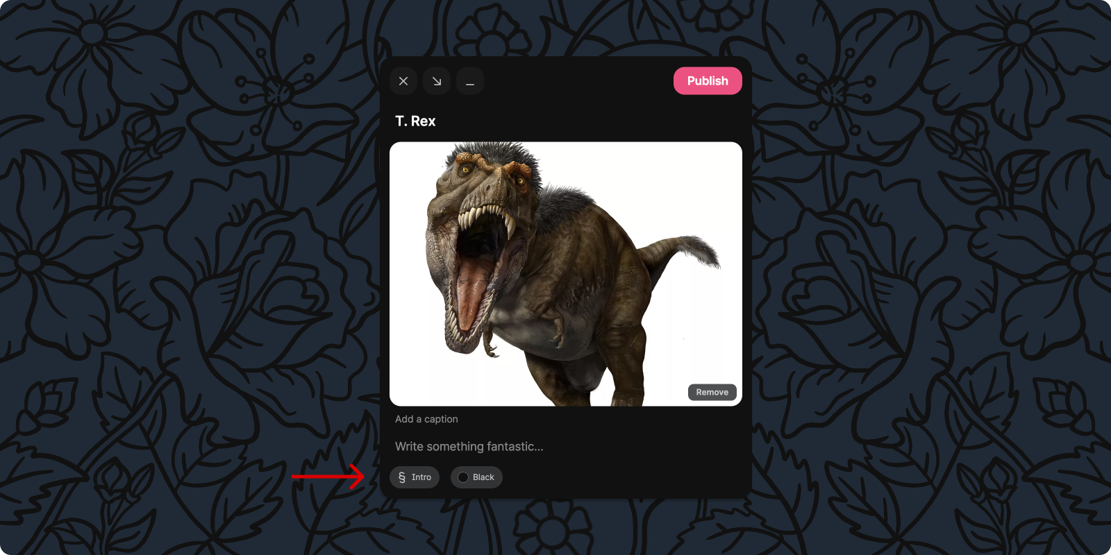
In adding new post buttons, we had to add logic to determine where new posts appear, which meant adding the concept of a default section. So, if you add a new post through the global post button (the big plus button at the bottom of a padlet), it will be added to the last section you posted in, but if you haven’t posted yet, the post will be added to your default section. Of course, you can always adjust which section the post is added to because we added a section selector to the post composer.
Making padlets with sections
Of course, we couldn’t just add sections to padlets and call it a day. We needed to weave them into the entire process of creating a padlet. Starting at the beginning, we updated our “make a padlet” panel on the dashboard. When you make a new padlet, you will now have the choice to create with or without sections. If you want to visualize what your padlet could look like, you can hover over the options to preview each format.
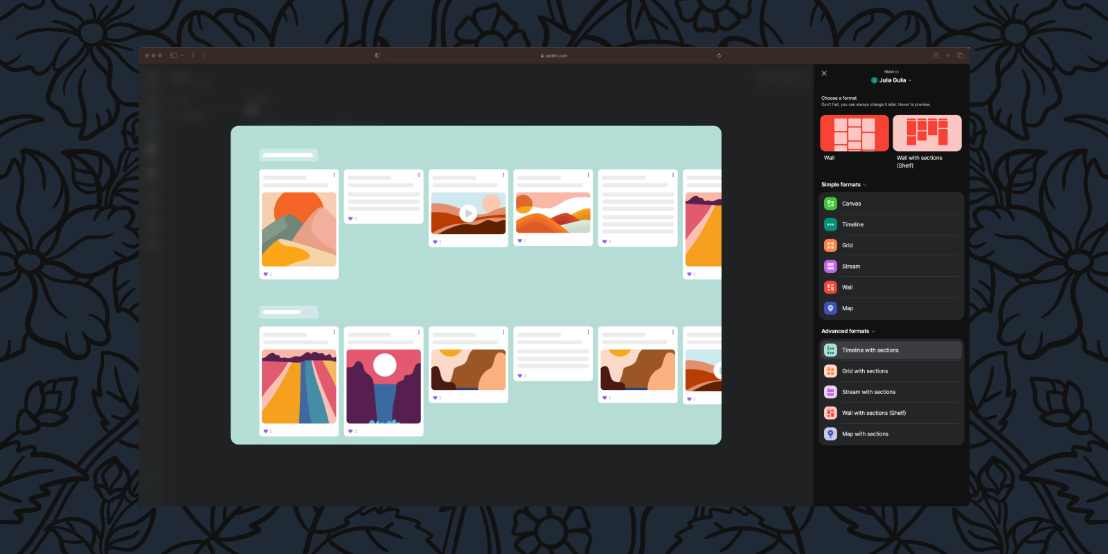
To support sections in the middle of the padlet creation process, we have added a layout section the padlet settings panel. That way, you can add sections to existing padlets. Not only can you toggle sections on and off from the new settings panel, but we’ve updated the UI and added support for real-time updates, so you’ll know if someone is changing the settings at the same time as you.
Sections and Slideshow
Introduced last month, Padlet Slideshow allows you to create beautiful presentations with a single click. Because slides are often grouped into different topics, sections complement Slideshow. In Slideshow, section headers will appear as their own slides, which will help provide more structured presentations.
When will sections be available?
Immediately on desktop and mobile.
Who will have access to sections?
Everyone.
We hope sections will help you stay organized, and we’d love to hear your feedback on these changes. As always, you can contact us here or send a tweet @padlet.

