Introducing Slideshow: beautiful, auto-designed presentations
If you can build a padlet, you can build a beautiful presentation.

You need to build a presentation. You have all the content you need. You have the images, the links, the videos, and you have all the wonderful text.
All you need to do is put the content in a nice aesthetic package. This should be simple. You sigh in frustration. If only it were simple.
You open up Google Slides (or PowerPoint, or Keynote). You are met with blank white page. Staring back at you is an enormous title text box set to bold Arial font and an ugly little sickly grey subtitle.
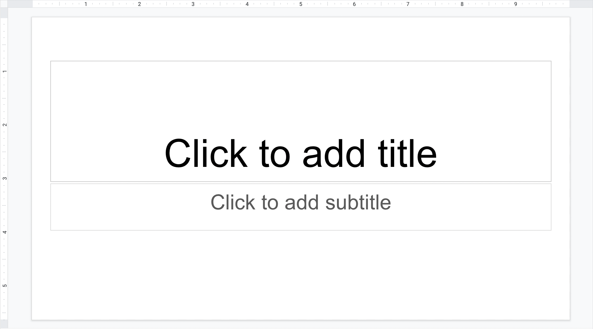
This interface glowers at you. It has been designed intentionally to stifle your creativity. This interface is a time traveler from a dystopian future where color and laughter have been made illegal. In order to build your slideshow you are tasked with manually rewiring every fiber of his brain.
You begin by browsing the offered themes. Most are better than blank white, but all feel generic, soulless, and corporate.
Maybe a photo will help. You copy and paste a key image. For some reason it fills up the entire slide. You begin resizing and reformatting and dragging. Desperately you wrangle the little red alignment lines. They scatter and dance around your page and do everything they can to evade you.
You decide to improve your text. You look through the font options. There are literally hundreds of fonts. More fonts than anyone could need, use or know. If fonts were foreign national treasures, Google Slides would be the British National Museum. If fonts were Patagonia jackets, Google Slides would be San Francisco.
You try a few and settle on Times New Roman. You change the font color. The options they suggest all somehow make your text look like it was written by a child.
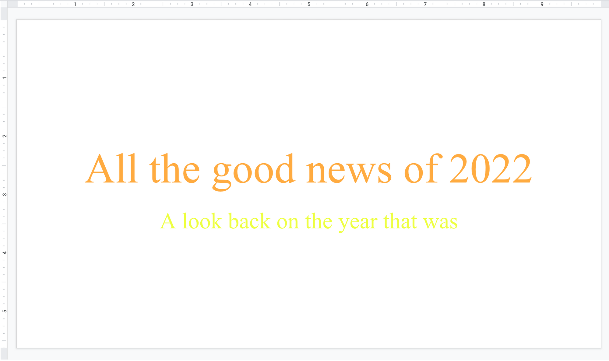
You check the clock. You’ve been working for 45 minutes and you’ve made two slides that you aren’t proud of.
You have a few options:
- Choose one of the generic themes from the catalog, input your content, and end up with a slideshow that you aren’t proud of and won’t impress anyone.
- Pay $69.99 for the 12 step tutorial on how to build slide decks, watch 4 unrelated YouTube videos because the tutorial was a scam, pay a kid from Indonesia $25 to make your slides for you. He uses one of the generic themes from the catalog.
- Leave it all behind. Move to Nebraska. Grow corn. Live from sunrise to sunset and wash the soil from your hands at the end of every long day.
The solution: Padlet Slideshow. If you know how to build a padlet, you know how to use Slideshow. Post your content on a padlet and click the Slideshow button. Build presentations 10x more beautiful in 10% of the time. Here’s how:
Beautiful and complete design in one single click
Slideshow is a miracle cure that actually works. It’s too good to be true and yet, here it is. You add your content to a padlet, and you click the button. Like magic, you have a beautiful presentation.
Every post becomes a slide. The fonts are sized automatically. The colors are determined by your chosen wallpaper. You can navigate with your cursor or your keyboard. The presentation will be updated live when you edit the padlet it references.
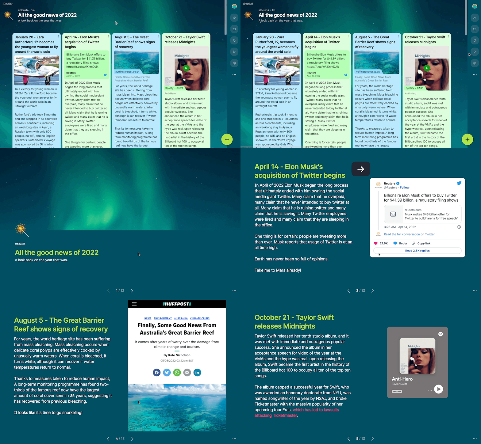
You will never need to resize the font. You will never need to scale photos. You will never need to choose colors that work together. Everything will work perfectly and look great instantly.
If you can copy and paste your thoughts and attachments into a padlet, you can create a beautiful presentation. Yes. It really is that simple.
Beautiful with any content
A post on Padlet can contain a subject text, body text, and any kind of attachment type. Any combination of these ingredients will be formatted to look great in Slideshow.

You post a huge block of text: the slide looks great. You post a YouTube link: the YouTube video will be playable in your slideshow. You post a tweet: the tweet displays as a preview in your slide.
Any kind of attachment combination will look great in your Padlet-generated slideshow.
Present on any device
One of the biggest disadvantages of making slideshows on traditional software like Slides, PowerPoint, and Keynote is that they confine your presentation to one screen size. With them, your presentation will only look good in the aspect ratio you design it in.
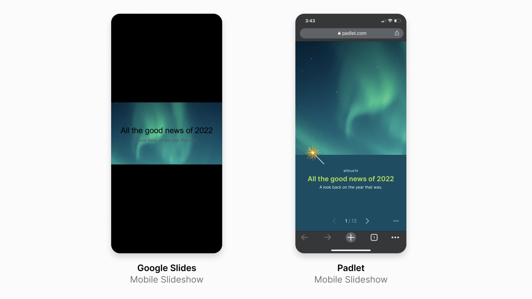
With Padlet, your slideshow will adapt and look beautiful on whatever screen it shows up on.
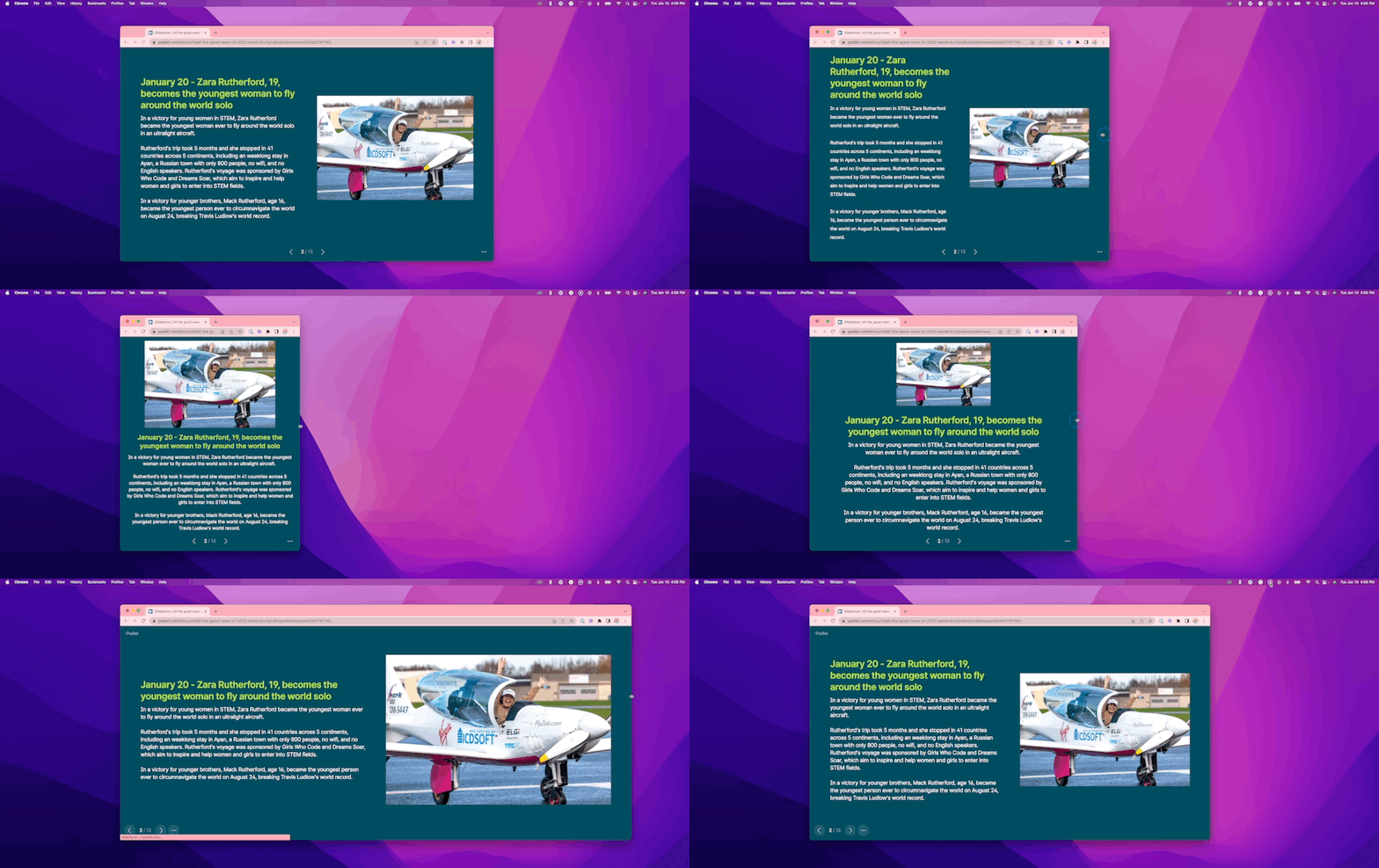
Set your slideshow free!
Create on any device
To build a slideshow with Padlet, all you need to do is to build a padlet. Making a padlet on mobile is easy. With Padlet slideshow view, you can now build and edit beautiful slideshows on your phone.
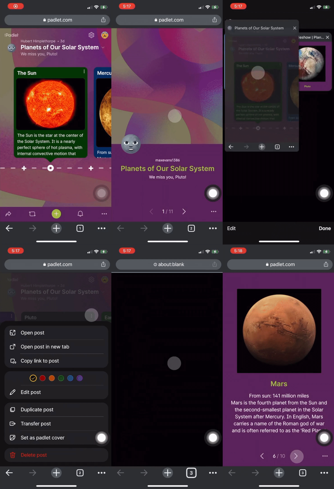
Remember, your slideshow will update automatically with your padlet. So if you’re on the way to a meeting and you notice a typo, or you want to delete an entire slide or change an image, you can make the edit on your phone and your slideshow will update automatically. You will never need to redownload files or reformat slides.
The designer’s monopoly on beautiful presentations is over
We encourage experienced deck builders with too much free time to continue handcrafting every detail of massive presentations. The rest of us are free to click a button and move on with our lives.
When will Slideshow be available?
Slideshow is available now on the browser version of Padlet on desktop, mobile, and iPad. Slideshow view is not currently available on the app but it is coming soon.

