What it takes to scroll well
An in-depth exploration of how we built interactive, smooth scrolling on Padlet.


With books, we can add as many pages as we want in order to communicate knowledge to our readers. With screen devices, all we have is one single frame to compress all of that information. But thanks to Aza Raskin who popularized the concept of scrolling via the invention of infinite scrolling, we all have learned how to create and consume endless content in our little screens.
As developers then, how do we actually bring an enjoyable scrolling experience to our users for content that has an end?
The most basic attribute to enable scrolling
Scrolling is primarily enabled using a CSS property known as the overflow. We could declare a class as such to enable scrolling.
.scrollable {
  overflow: auto;
}
While we could have set overflow to scroll, setting overflow to auto makes it so that the scrollbar only shows on the element if the height of its content exceeds its content, rather than all the time. This enhances user experience.
However, what happens if we would like scrolling to be controlled by elements outside of the target element?
This is a common use case for devices with small screen sizes to navigate to specific sections in a page.
For example, given a tall scrollable container element containing 3 section elements with its height determined by its children, when the user clicks on button C, we expect the container to scroll to the top of section C.
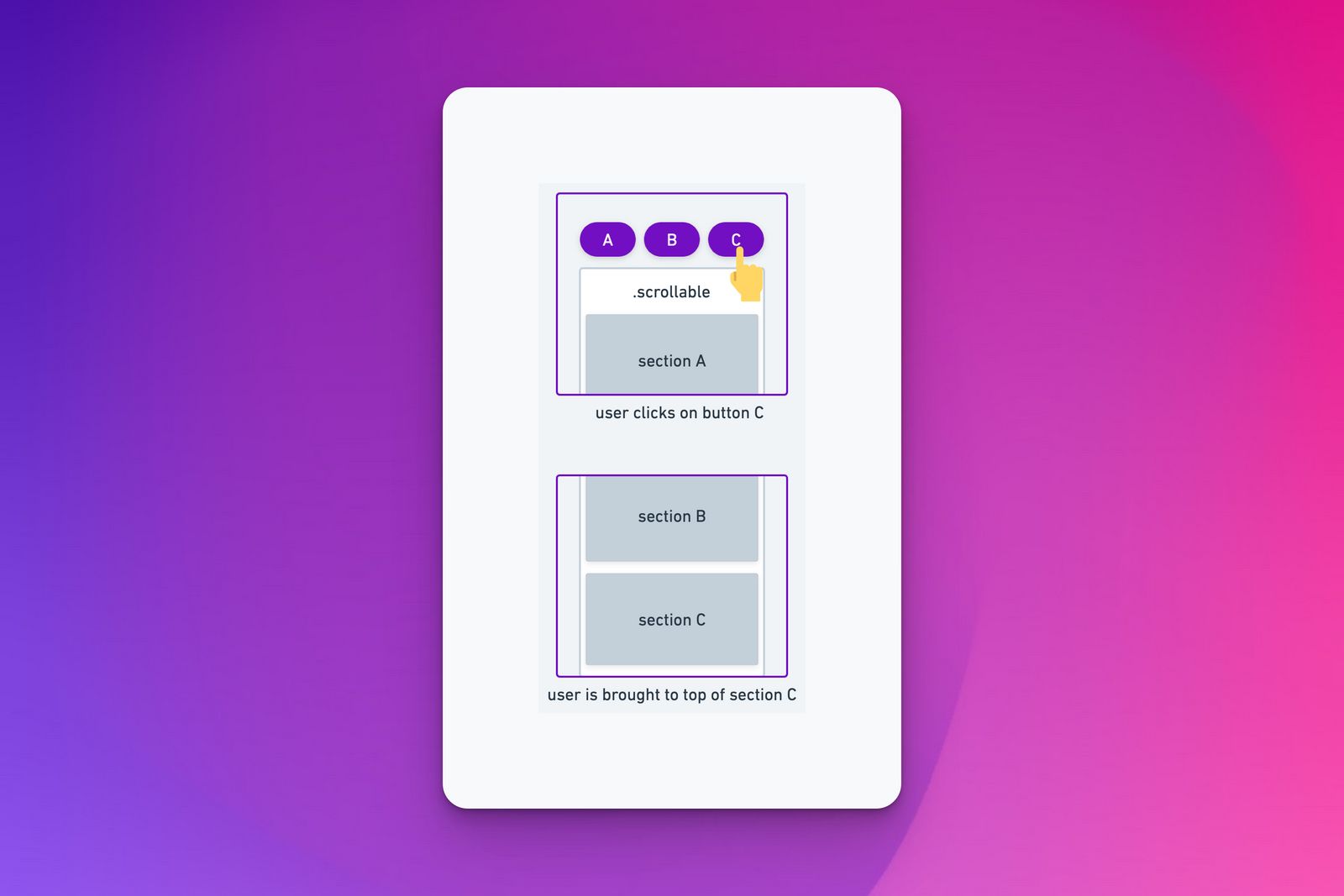
Notice that in the illustration, section C is not directly at the top of the viewport. This is because a scrollable element cannot scroll beyond its height, which is either a fixed height or dynamically expanded by the height of its children.
Now, this is where things can get a little tricky.
Scrolling to a specific section
In order to add functionality to scroll to a specific section, we would need to know the y-coordinate of the section element (y) and scroll on the parent container element down by y pixels.
const x = 0
document.querySelector('.scrollable').scroll(x, y)
But how do we know what is y?
Thankfully, the Web API provides us with many handy attributes we can access directly from HTML elements, including the getBoundingClientRect() method and offsetTop attribute to know exactly where the y-coordinate of the parent container element and child element is.
Using the properties above, we can write a simple function to scroll to the top of a child element inside the scrollable parent.
function scrollToTopOf(e: HTMLElement): void {
  const elementInChargeOfScrolling = document.querySelector('.scrollable')
  const containerElementY = containerElement.getBoundingClientRect().top
  const elementClientY = e.offsetTop
  const targetY = elementClientY - containerElementY
  elementInChargeOfScrolling.scroll(0, targetY)
}
This function is applicable for most common use cases, but what if we have multiple elements on the screen with .scrollable?
The function above would be problematic since document.querySelector() returns the first Element within the document that matches the specified selector, so it might not get the correct scrollable container that we want.
To resolve this, we wrote another function that relies on a convenient Web API method .closest().
Getting the right scrollable parent container
In our project, we used tailwind CSS for styling, so we check for the closest parent element that can have one of the various possible selectors that enables scrolling.
function getNearestScrollingElement(element: HTMLElement | null): HTMLElement | null {
  if (element == null) return null

  const scrollableStyleSelectors = [
    '.overflow-auto',
    '.overflow-y-auto',
    '.overflow-x-auto',
    "[style*='overflow:auto']",
    "[style*='overflow-y:auto']",
    "[style*='overflow-x:auto']",
  ]

  const closestElement = element?.closest(`*:is(${scrollableStyleSelectors.join(', ')})`)
  if (closestElement != null) {
    return closestElement as HTMLElement
  }

  return null
}
Integrating getNearestScrollingElement into the scrollToTopOf function, this is what we get.
function scrollToTopOf(e: HTMLElement, duration: number): void {
  const elementInChargeOfScrolling = getNearestScrollingElement(e)

  if (elementInChargeOfScrolling != null) {
    const containerElementY = elementInChargeOfScrolling.getBoundingClientRect().top
    const elementClientY = e.offsetTop
    const targetY = elementClientY - containerElementY
    elementInChargeOfScrolling.scroll(0, targetY)
  }
}
If we try out this function now, we will see that the container does work effectively as intended, but it doesn’t feel as good because the change happened too immediately. So let’s add some smooth scrolling.
Smooth Scrolling
While the Web API has been very helpful for us, and it also has a method for scrolling, the downside of this method is that we cannot control the speed or duration of the smooth scrolling.
There is an option parameter to set the scrolling as smooth as such:
scrollTo({behavior: 'smooth'})
However, it is a preset smooth scrolling behavior that we cannot configure.
In scrollable containers that have a lot of content, this will cause the container to become very tall, and it may take a whole second or even two for the user to be scrolled from the top of the panel all the way down to the bottom.
jQuery is an often quoted, old and gold solution to address such problems where most functions that Web API has yet to make customizable. However, we wanted to reduce our dependency on it to comply with modern web app practices.
Hence we came up with our own implementation of smooth scrolling, which uses a custom easeInOutCubic function and the requestAnimationFrame Web API method.
function easeInOutCubic(t: number, b: number, c: number, d: number): number {
  t /= d / 2
  if (t < 1) return (c / 2) * t * t * t + b
  t -= 2
  return (c / 2) * (t * t * t + 2) + b
}

/**
 * This function uses the requestAnimationFrame API and a easeInOutCubic function
 * to simulate smooth scrolling. This is helpful because not all browsers support smooth scrolling,
 * and the native Web API for smooth scrolling does not allow for scroll speed/duration configuration.
 *
 * @param {HTMLElement} el - element to scroll
 * @param {number} to - target y-coordinate
 * @param {number} duration - animation duration of scrolling
 */

function smoothScrollTo(el: HTMLElement, to: number, duration: number): void {
  const from = el.scrollTop
  const distance = to - from

  let start: number
  function step(timestamp: number): void {
    if (start === undefined) start = timestamp
    const elapsed = timestamp - start

    // Apply the ease-in-out animation
    el.scroll(0, easeInOutCubic(elapsed, from, distance, duration))
    if (elapsed < duration) {
      window.requestAnimationFrame(step)
    }
  }

  window.requestAnimationFrame(step)
}
With this, we achieved the functionality for perfect smooth scrolling to specific elements.
But are we done yet? Well, we can do more!
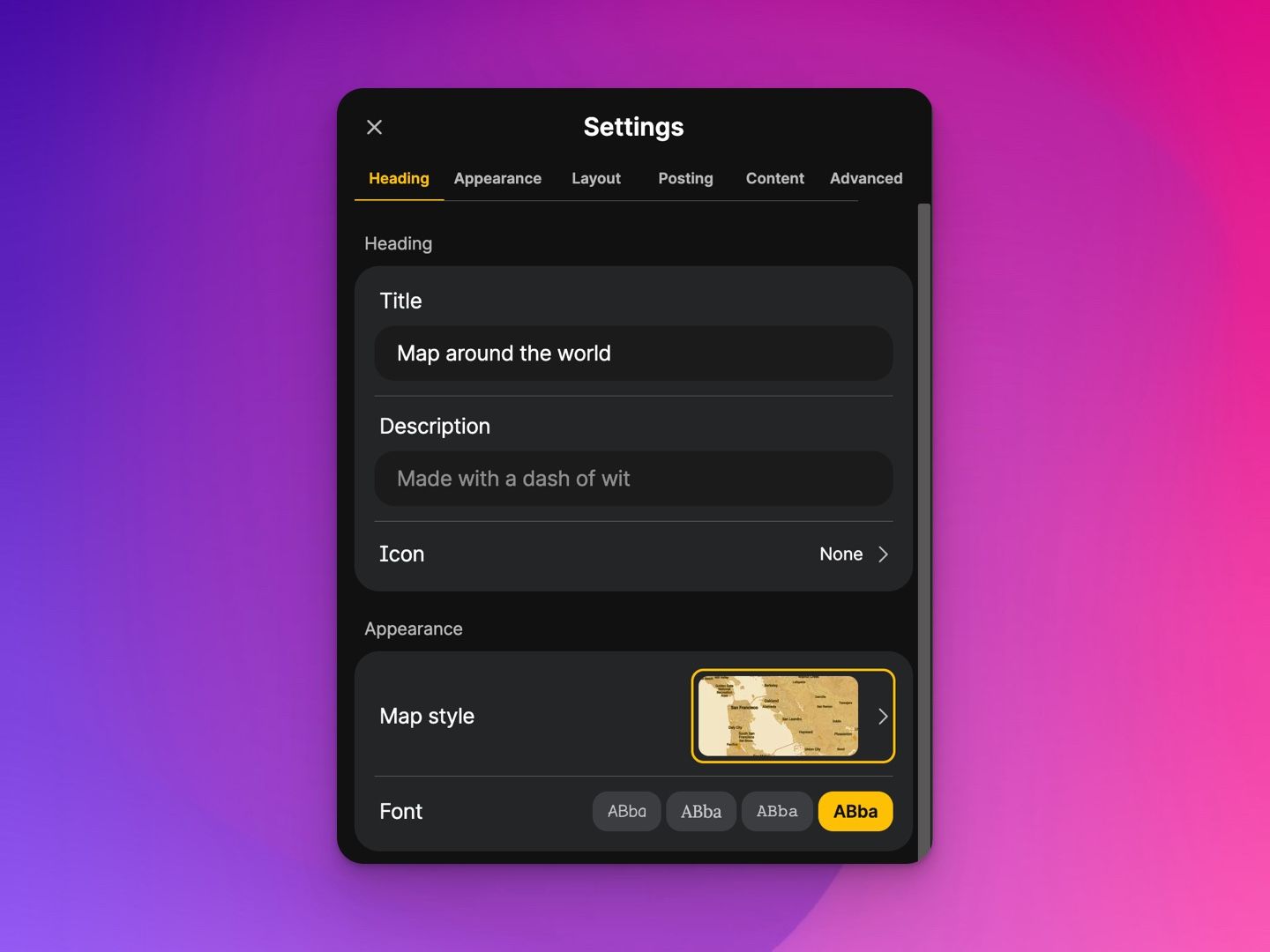
In the recent Padlet’s rollout of the newly furnished Settings Panel, as the user scrolls, they can see which section they are at as they scroll down with the nav bar at the top of the panel.
This is what I call interactive scrolling.
Interactive scrolling
To achieve interactive scrolling, we need to keep track of the sections that the user can see and then set the active section as they scroll.
A standard way to check if elements are visible is by using getBoundingClientRect() once again. Here’s a function to do that.
function isElementInViewport(element): boolean {
  const rect = element.getBoundingClientRect()
  return !(
    rect.top > (window.innerHeight || document.documentElement.clientHeight) ||
    rect.right < 0 ||
    rect.bottom < 0 ||
    rect.left > (window.innerWidth || document.documentElement.clientWidth)
  )
}
However, there are a few flaws with this approach.
- This assumes that the scrollable container spans the entire height of the user’s viewport. But the scrollable container can always be shorter than that.
getBoundingClientRect()is actually an expensive function to use since it forces the web engine to constantly recalculate the layout. This would actually cause significant lag if we were to call this function on every scroll event to check the visibility of elements, as compared to only calling this function on navigating to a specific section.
Hence, after much research, we find the use of the IntersectionObserver to be much suited to the use case of tracking visible elements on scroll.
Using the IntersectionObserver, whenever we hit a certain visibility threshold, we will update the visibility of the section elements. The code below is Vue, but you can adapt it for any framework as well.
// pass in your list of section elements
// An easy way to differentiate your section elements could be to add an id or a dataset property to the element e.g.
// <div data-key='heading-section' />
const elements: Ref<HTMLElement[]> = []

// Create a list of booleans whose index matches the index of the element in the list above
const visibleElements = Ref<boolean[]> = []

function startObserving(): void {
  observer = new IntersectionObserver(
    (entries) => {
      entries.forEach((entry) => {
        // find the section element that is actually being observevd in this IntersectionObserver entry
        const index = elements.value.findIndex((el) => el.dataset.key === (entry.target as HTMLElement).dataset.key)
        // if we can find the section element, then we set its visibility according to whether it is intersecting with the viewport.
        if (index !== -1) {
          visibleElements.value[index] = entry.isIntersecting
          const selectedElementKeyIndex = visibleElements.value.indexOf(true)
          if (selectedElementKeyIndex !== -1) {
            selectedElementKey.value = elements.value[selectedElementKeyIndex].dataset.key
          }
        }
      })
    },
    {
        // we set multiple thresholds so that it will check frequently whether the visible elements are out of sight as the user scrolls. you can add more but it will probably be more computationally expensive.
      threshold: [0, 0.2, 0.4, 0.6, 0.8, 1],
    },
  )
  elements.value.forEach((item) => {
    observer?.observe(item)
  })
}
Note that multiple section elements can be concurrently visible.
Based on this visibility array, we can show the user which section they are in. There are different ways to define the active section which will be covered later, but for simplicity, Padlet implements the active section as the one that is located highest in the container and is visible to users.
For example, in the following screenshot, both heading and appearance sections are completely visible, but we show the heading section as the active section.
And that’s how we achieve interactive, smooth scrolling!
The next part is an optional food for thought for you on what the active section should be.
Where is the user really at?
In the words of my colleague Yong Sheng, sometimes one’s perception could also depend on one’s height. Little kids tend to notice toys that are placed at their height more than anything else in supermarkets, even though most of us probably wouldn’t even notice that those toys were there!
The same could apply to the concept of the active section.
In the context of a user’s usual scrolling behavior,
- As the user is scrolling down, if the bottom-most section is visible, then that section should be the active section.
- As the user is scrolling up, if the topmost section is visible, then that section should be the active section.
However, we don’t actually know where the user is actually focusing their eyes in the context of bigger screen sizes. Sometimes users are relatively shorter or taller than their screens and their focus will be different.
In the case where the multiple elements in the scrollable element are entirely visible in the viewport, the user could be focusing on any of the sections.
Conclusion
In this article, we learned concepts on what enables scrolling and how we can enhance user experience with interactive scrolling. Everything comes to an end, and so does this article. Nonetheless, helping others enjoy their journey of navigating through life and content is a thoughtful and satisfying experience.
Below are some more gifts for you to further your knowledge of concepts on scrolling.
Other interesting resources
Readings
- You Might Not Need jQuery - code snippets of using modern HTML vs Web API jQuery to achieve certain use cases
- Infinite scroll with Next.js, Framer Motion, and Supabase - a step-by-step demo on infinite scroll and animation. Hint: you can actually improve the implementation here using what you learned in this article!
Interactive
- Intersection Observer Playground - see how the intersection observer work by configuring the controls yourself
- Make your website stand out with a custom scrollbar 🌟 by the author of the article you’re reading now - learn the basics of how a scrollbar is styled
P.S. We're hiring! If you believe in Padlet, we'd love to hear from you. Apply now!